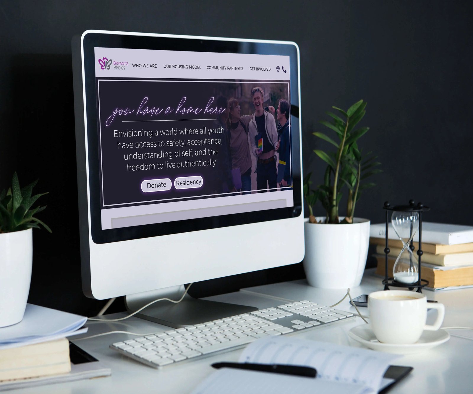
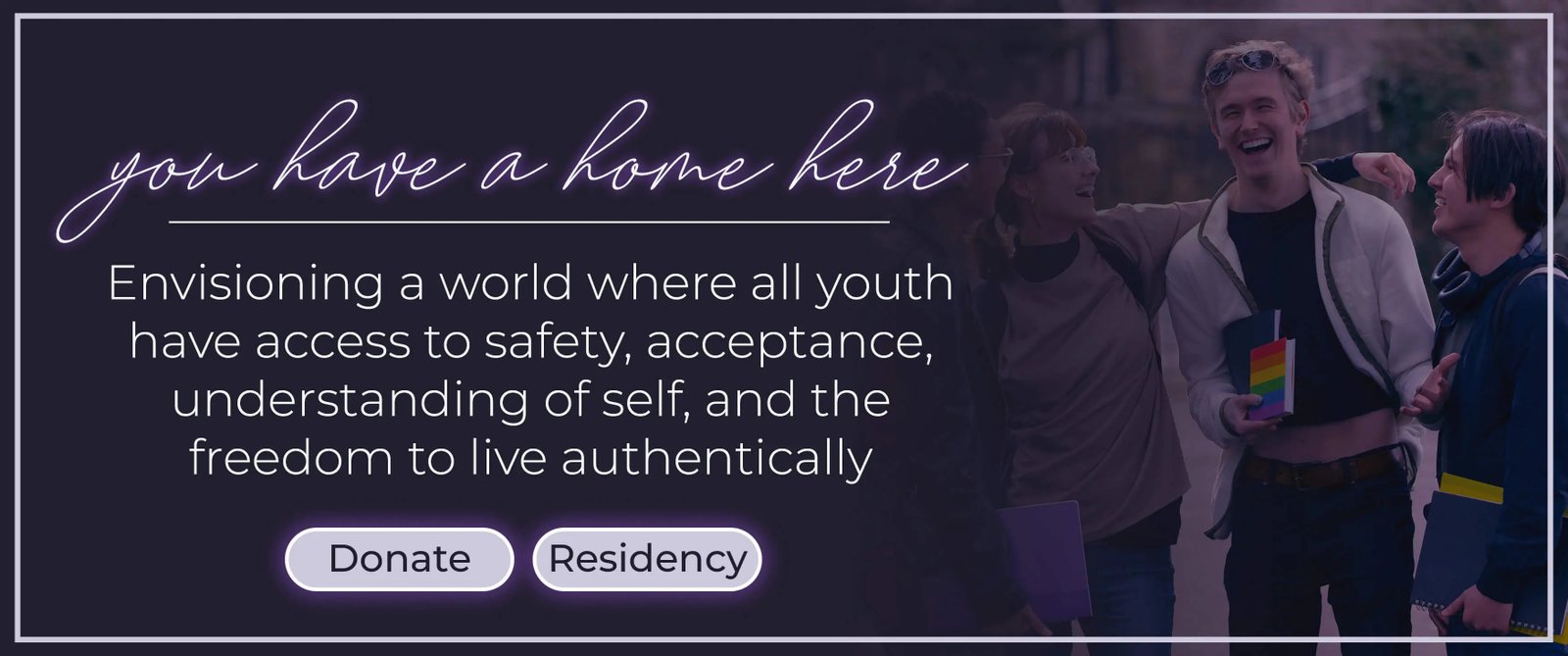
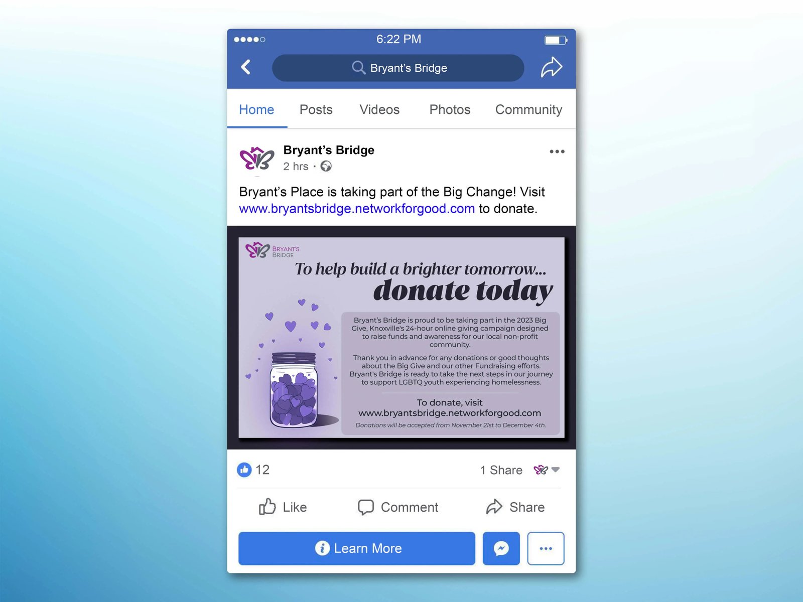
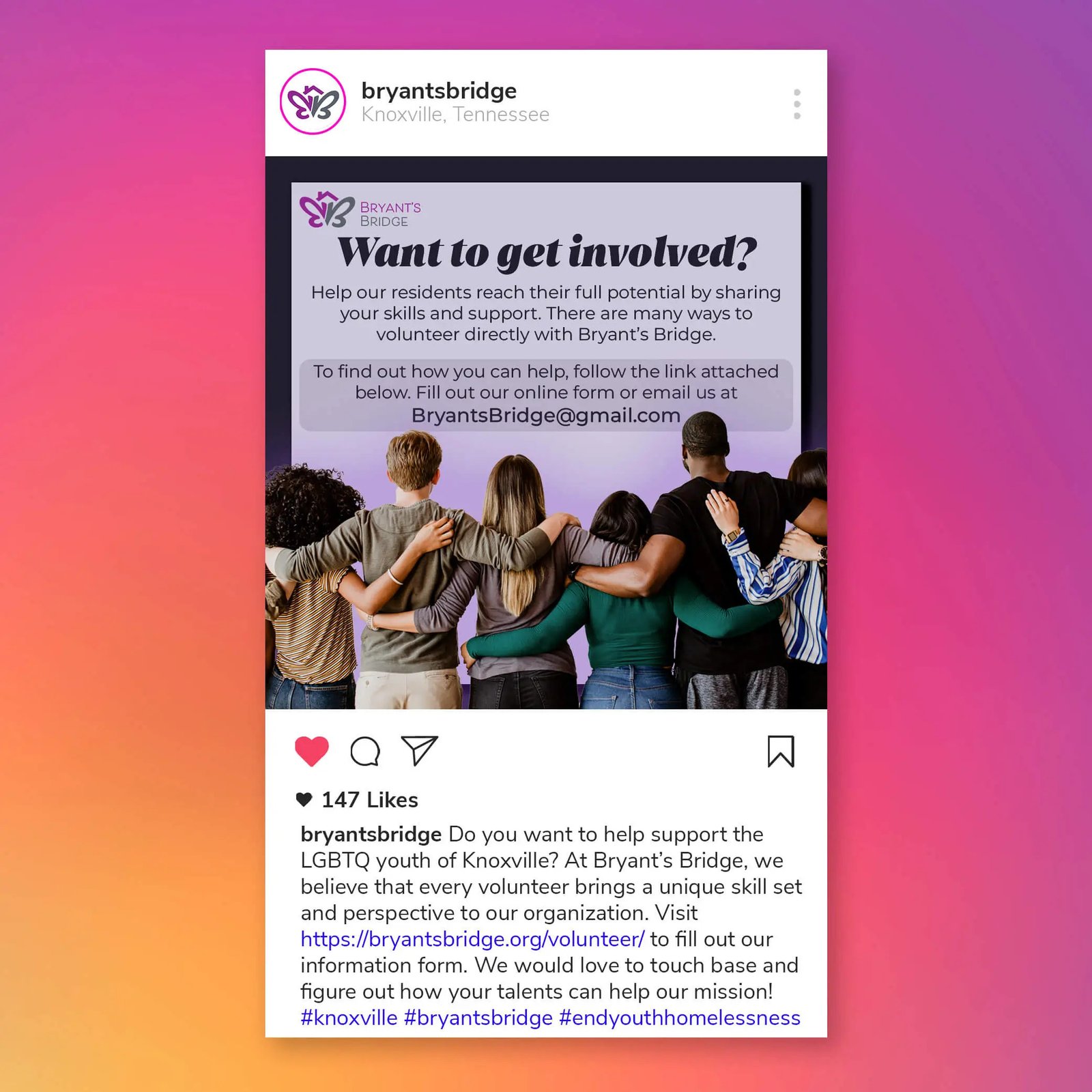
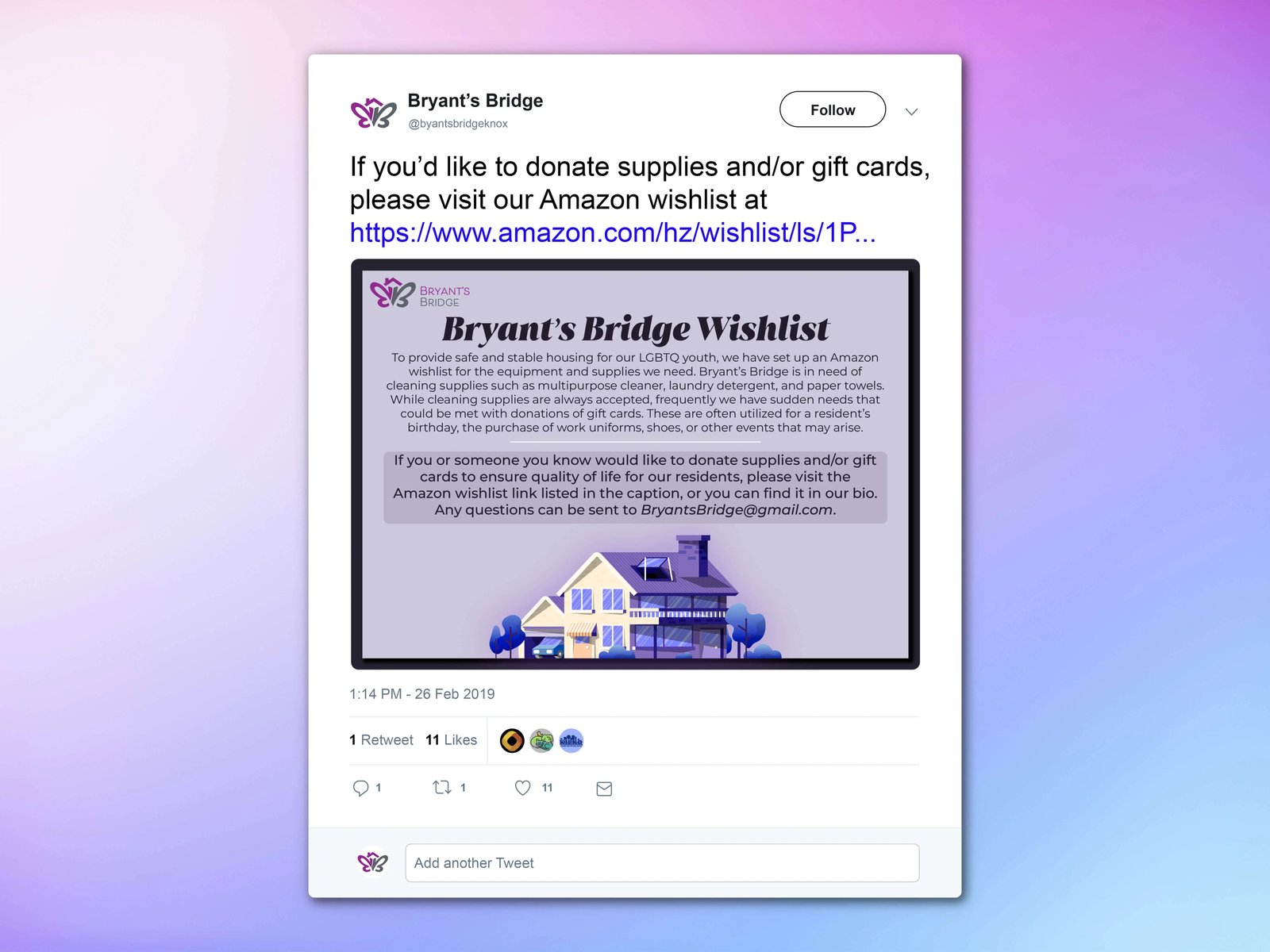
Bryant’s Bridge is a digital marketing project that sought to rebrand an organization deserving of recognition. Utilizing purple as its primary color, it communicates a sense of peace and acceptance.
Welcoming and familiar fonts were chosen for this marketing project with the goal of embodying the spirit of the organization.
With LGBTQ+ youth being at a higher risk of experiencing homelessness, it was crucial to create a digital campaign that
invited in those who may be hesitant to ask for help.
 Previous